What Happened to the Lily: A Q&A on Our New Brand
As our new and revitalized brand rolls out, we know that you may have many questions about what's changing at Easterseals. We're here to explore the exciting new face of Easterseals, and share our invigorated vision.
Something looks different…
We’re glad you noticed! Today we launched a new, revitalized brand. It’s a re-introduction to the American public as the indispensable resource for individuals and families facing today’s disabilities. It’s something we’ve focused on for almost two years, and we’re so excited to finally unveil the results to our friends like you.
Over the next year, you’ll see our fresh new brand take hold over our website and social media, through a variety of communications and across our local centers.
One thing we aren’t changing is who we support or how we make a difference. We remain the champion for people living with disabilities, veterans, caregivers and families.
Why now?
Disabilities have become increasingly complex in the 21st century. The definition of disability itself is broader, going beyond the physical to include emotional, intellectual, social and educational issues.
As we’ve evolved with the times, expanding in scale and scope to meet new and emerging needs in our communities, our work’s become less distinct and visible. There are millions more we could be helping, who just don’t know enough about us.
That’s where the good news starts! This new brand is a banner for us to change the way the world views and defines disability, not as a condition that labels people, but as a barrier, a part of life that affects all of us. To ensure we’re ready, we’ve challenged ourselves to think outside the box — or the lily, if you will.
Wait…what’s happening to the lily?
The lily will always have a soft-spot in the history of Easterseals, and while it certainly had a good run, the lily never spoke to the work we do day-in and day-out in communities like yours.
Instead we’ve unveiled a new logo that speaks to our actions and unified voice. Intentionally all lower case, each letter is crafted to be open, accessible, readable, distinct, a visible expression of our commitment to be personal, honest, determined and local.
The new design around our name appears as rays of light, hope, sunshine, radiating out from the “e.” The deliberate grouping of circles in the new logo symbolize our breadth, our scope, our network, our communities, our individuals served, all coming together to take on disability.
What’s the meaning behind “Easterseals”
We’re introducing a new word to your vocabulary, Easterseals. Separately, the words Easter and Seals conjure various connotations for many people, or misunderstandings about who we are and what we actually do. Together, the new single word works to strip away this confusion and pay tribute to our legacy and past with a new openness to build our own meaning for the name.
So is orange the new red?
We sure hope so! We’re now Easterseals orange, and a little Easterseals yellow. Orange and yellow convey a personality that’s informal, warm and engaging, and exudes confidence and fearlessness. All traits our friends use to describe us, and we strive to live up to everyday.
Tell me more about “Taking on disability together”
Taking on disability together is a brief distillation of our purpose statement. Its significant presence within the logo works to answer the million dollar question, what does Easterseals do anyway?
The tagline links Easterseals quickly to our cause, to disability, and establishes an active call-to-action for others to join with us, be a part of an important movement.
Easterseals is you, me, all of us. Taking on disability together.
See what an Easterseals CEO and mom thinks about the new brand!
Discover more about our fresh new brand and the exciting things to come.

Our Blog
-
Navigating Through the Red Tape: Disabled Veterans and Financial Wellness
Wednesday, May 1, 2024, 11:48 AMNavigating Through the Red Tape: Disabled Veterans and Financial Wellness
Wednesday, May 1, 2024, 11:48 AM
Earlier this month, Easterseals visited Washington D.C. to meet with representatives and share ways …
Read this Post -
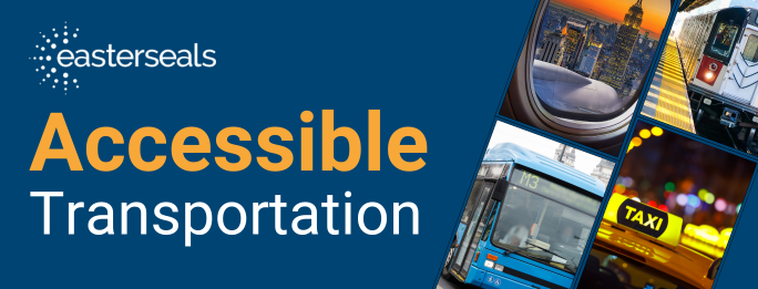
Communities Making Accessible Transportation: How We Can Work Together
Monday, April 15, 2024, 10:56 AMCommunities Making Accessible Transportation: How We Can Work Together
Monday, April 15, 2024, 10:56 AM
By Jeremy Johnson-Miller “How did you get here today?” For many, this may never be a second thought,…
Read this Post -
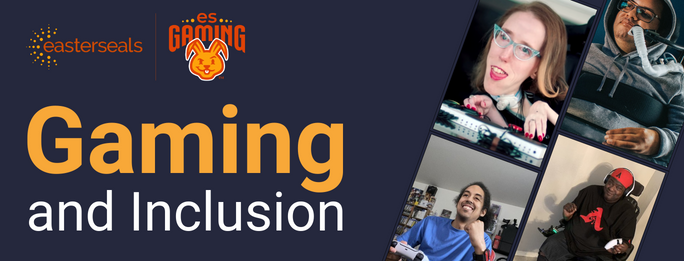
Level Up: Disability Employment in Gaming
Tuesday, April 2, 2024, 11:11 AM
By Grant Stoner As a medium, video games allow us to remain connected. Whether it’s long-distance re…
Read this Post

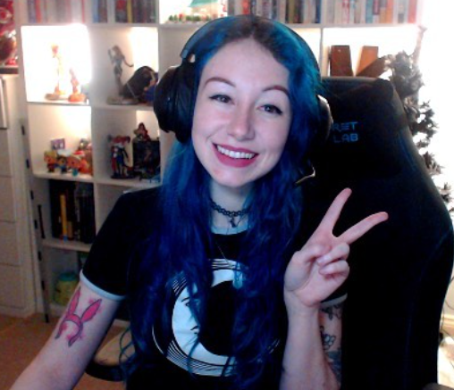 “Streaming is both accessible and not accessible,” Evans said. “The streaming part itself is accessible, in that it allows me to make my own schedule, and I can work it around my disabilities. However, the inaccessible part is the demand for content creators to constantly be networking, attending events and continuously pushing out content. I cannot attend events, and if I can they’re incredible stressful, so all my work networking has basically been done online, which thankfully is becoming a more acceptable side of content creation.”
 “I must say over the years it has become less and less accessible for me,” Martínez said. “SMA (Spinal Muscular Atrophy) causes strength, endurance and mobility loss as time passes. I can’t use a physical keyboard as I used to, so it’s been years now with an on-screen keyboard. Voice dictation doesn’t work well for me due to my voice being inconsistent, not to mention my accent. In English it can go from totally wrong to acceptable. In Spanish, my native language, it works better.”
 “What drew me to consulting was the opportunity to leverage my unique perspective as both an able-bodied and disabled gamer to improve the gaming experience for others,” Lane said. “I can share the frustrations I’ve faced as a disabled gamer and use that knowledge to advocate for better accessibility features. Companies and studios that I work with go the extra mile to make sure I have everything I need to succeed.”


Connect with us on social media